5 Best Colour Combinations for a House Exterior
Stephen Griswell • March 22, 2026
When most people decide to paint their home, they head straight for the paint chips. But here’s a pro tip: the secret to a beautiful exterior starts with the elements you can’t change. Your roof, brick, or stone accents have their own distinct undertones that provide the perfect roadmap for your color palette. By working with these fixed features instead of against them, you can create a cohesive and harmonious look that feels intentional and professionally designed. This guide will show you how to build your palette from the ground up, ensuring you find the best colour combination for house exterior that feels like a natural fit for your home.
Key Takeaways
- Start with Your Fixed Features: Your home's roof, stonework, and architectural style provide a built-in color guide. Select paint colors with undertones that match these permanent elements to create a naturally harmonious look.
- Always Test Colors on a Large Scale: A small paint chip looks different on a large wall, so test your top choices on big sample boards. Move them around your home at different times of day to see how sunlight and shadows change the color before you commit.
- Balance Your Palette for a Polished Look: Use the 60-30-10 rule to create a visually balanced exterior, with a main color, a secondary trim color, and a smaller accent color. This simple ratio helps you combine colors confidently and gives your home a professional, well-designed finish.
First Things First: What Makes a Great Exterior Color Scheme?
Picking the perfect exterior color for your home feels like a huge commitment, but it doesn't have to be stressful. A great color scheme does more than just look good; it highlights your home’s best features, reflects your personal style, and boosts its curb appeal. Before you get lost in a sea of paint swatches, let’s walk through the three key things that will guide you to the perfect palette. By starting with these fundamentals, you can choose your colors with confidence.
Consider Your Home's Architecture
The best place to start is with your home's bones. Its architectural style offers a built-in roadmap for color. A historic Victorian can handle deep, complex combinations, while a modern farmhouse shines with clean whites and dark accents. As paint experts at Sherwin-Williams note, "Bold and optimistic colors create a contemporary style that complements the clean, simple lines of mid-century modern homes." Thinking about your home's design first helps you narrow down the options and ensures the final look feels cohesive and intentional. You can find great inspiration in these exterior home style color palettes to see what works for styles similar to yours.
Check Your Neighborhood Vibe (and HOA Rules)
Your home doesn't exist in a vacuum, so take a walk around your block. What colors do you see on neighboring houses? The goal isn't to copy them, but to choose a palette that feels harmonious with the streetscape while still letting your home’s personality shine. This is especially important if you live in a community with a Homeowners' Association (HOA). Before you fall in love with a specific color, be sure to check your HOA guidelines, as they often have a pre-approved list of colors. This simple step can save you a major headache and a potential fine down the road, ensuring your beautiful new paint job is fully compliant.
Work With What You've Got: Roof, Stone, and Landscaping
Some of your home's biggest features aren't going anywhere, so it's best to work with them. Start your color search by looking at the elements that won't change, like your roof, stone, or brick. These fixed features have their own undertones that your paint colors should complement. For example, a charcoal gray roof pairs beautifully with cool blues, while a brown roof works well with warm, earthy tones. If you're planning a new residential roofing project, you have a great opportunity to coordinate your roof and siding for a completely refreshed look. Don't forget your landscaping, either; the greens of your lawn and garden can make certain siding colors pop.
5 Can't-Miss Exterior Color Palettes
Ready for some inspiration? These five color palettes are popular for a reason. They offer a balanced and beautiful look that can suit a wide range of home styles, from classic colonials to modern farmhouses. Think of these as starting points to help you find the perfect combination for your home's exterior.
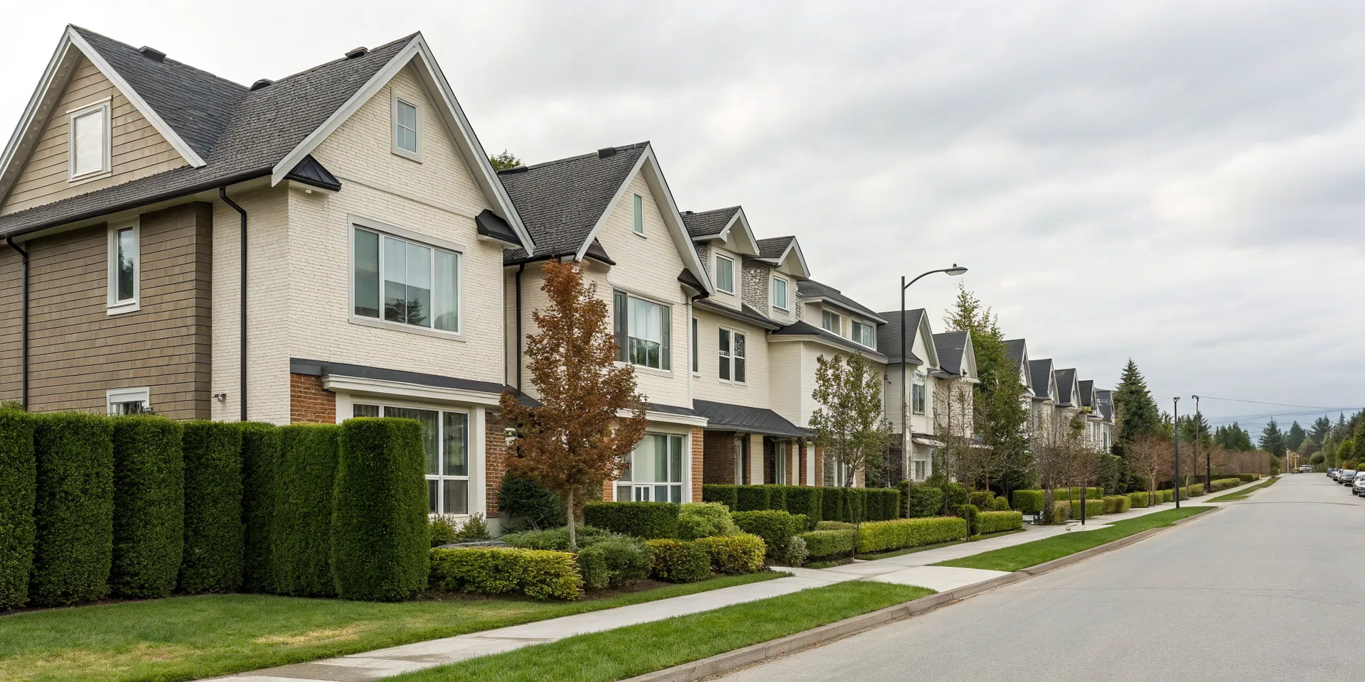
Warm Greige, Deep Charcoal, and Crisp White
If you're aiming for a look that’s modern but still feels warm and inviting, this combination is a winner. Greige (a mix of gray and beige) serves as a perfect neutral main color, creating a soft, welcoming backdrop. Deep charcoal adds sophisticated contrast and visual weight when used on shutters, trim, or even a garage door. A touch of crisp white on window frames, fascia, and soffits keeps the whole look clean and defined, making the architecture pop. This palette is incredibly versatile and gives your home a polished, contemporary feel without feeling cold. It’s a safe but stunning choice that works well with various stone or brick accents you may already have.
Navy Blue, Soft Gray, and Bright White
For a bold yet timeless statement, you can’t go wrong with navy blue. It has a classic, almost nautical charm that feels both elegant and strong, making it a standout choice in any setting. Pairing deep navy siding with soft gray accents on a porch floor or gables creates a striking, layered contrast. Bright white trim is essential here, as it sharply outlines windows and rooflines, highlighting your home’s architectural details. This combination feels fresh and clean, offering major curb appeal that stands out in any neighborhood. It’s a confident choice that works beautifully on everything from a cozy cottage to a grand colonial.
Sage Green, Cream, and Natural Wood
To create a calm and earthy vibe, consider pairing soft sage green with a warm cream. This palette feels deeply connected to nature and provides a serene, welcoming look for your home. The cream trim softens the green, preventing it from feeling overwhelming and adding a touch of classic elegance. Incorporating natural wood elements is what truly makes this combination shine. A beautiful wood front door, garage door, or porch columns can really tie this entire look together. This combination is perfect if your home is surrounded by greenery or if you simply want to create a peaceful retreat. It’s a gentle palette that feels both fresh and grounded.
Classic Black and White with a Pop of Color
There's nothing more timeless than a black and white color scheme. It’s a high-contrast look that feels both modern and classic at the same time, offering a clean and sophisticated canvas. You can use white for the main siding and black for shutters, trim, and doors for a dramatic, graphic effect. The best part of this palette is adding a fun pop of color. A vibrant red, sunny yellow, or even a bright teal front door can add a touch of personality and make your entrance a true focal point. This entire look is a fantastic example of how strategic exterior painting can completely change your home's character, making it look sharp and intentional.
Terracotta, Cream, and Dark Gray
Inspired by Mediterranean and Southwestern styles, a terracotta color palette brings incredible warmth and character to a home’s exterior. This earthy, sun-baked orange-red hue is inviting and full of personality. When you pair it with a soft cream for the trim, it creates a beautiful, gentle contrast that keeps the look from feeling too heavy. Adding a dark gray for accents, like the front door or window frames, helps ground the warm tones and adds a touch of modern sophistication. This is a great choice for making your home feel unique and welcoming, and it pairs beautifully with many residential roofing materials like dark architectural shingles or clay tiles.
4 Things to Consider Before You Pick a Color
Choosing a paint color feels like the most exciting part of an exterior refresh, but there’s a little more to it than just picking a shade you love from a tiny swatch. Before you commit, it’s important to think through a few practical factors that will influence how the final color looks and performs on your home. These considerations go beyond simple aesthetics; they touch on durability, perception, and even your home's long-term value. Thinking about these elements ahead of time is the key to ensuring you’ll be happy with the result for years to come, avoiding that sinking feeling of "it looked different on the sample card."
Think of this step as a final check to make sure your vision matches reality. We’ll walk through how our Georgia climate, your home’s size, the changing sunlight, and your long-term plans can all play a role in finding the perfect palette. Taking a moment to think about these four points will help you choose a color that not only looks beautiful but also protects your investment and adds lasting value to your property. It’s the secret to getting that picture-perfect finish you’re dreaming of and making sure your exterior project is a complete success.
How Will Your Climate Affect the Paint?
Here in Georgia, our weather brings a unique mix of intense sun and high humidity, which should definitely factor into your paint choice. Darker colors absorb more heat, which can put extra stress on your siding and even slightly increase cooling costs. Lighter shades, on the other hand, reflect sunlight and can help keep your home cooler. Beyond the color itself, the paint's sheen, or its level of shine, is also important. Different paint sheens are best for different parts of your home's exterior. For example, a satin or eggshell finish is great for siding, while a shinier, more durable semi-gloss is perfect for trim, doors, and shutters that need to withstand more wear and cleaning. A quality paint job is one of the best exterior renovations you can make.
Does Your Home's Size Matter?
Yes, it absolutely does! Color can be a powerful tool for playing with perception. If you have a smaller home, a lighter color scheme can work wonders. As a general rule, light colors can make a smaller house look bigger and more prominent from the street. Shades like off-white, pale gray, or soft beige reflect more light, creating an open and airy feel. Conversely, if you have a large, sprawling home, dark colors can help it feel more grounded and distinguished without seeming overwhelming. Deep charcoals, navy blues, or rich greens can add a sense of substance and elegance to a larger structure. It’s all about using color to create the scale and presence you want.
How Does Natural Light Change the Color?
The same paint color can look completely different depending on the time of day and the quality of light. That’s why you should always check how paint colors look at different times of day, as sunlight and shadows can change them. The warm, golden light of morning and evening will bring out the warmer undertones in a color, while the bright, direct sun of midday can wash it out or reveal cooler tones. A color you love on a sunny afternoon might look dull on a cloudy day. Before making a final decision, paint large sample boards and place them on different sides of your house. Observe them throughout the day to see how the color shifts and ensure you love it in every light.
How Do You Balance Personal Taste with Resale Value?
It’s your home, and you should choose a color that makes you happy every time you pull into the driveway. However, if you think you might sell your home in the next five to ten years, it’s wise to consider resale value. Choosing exterior colors means thinking about your home's surroundings, what your neighbors' homes look like, and current trends. Wildly unique or overly bright colors might not appeal to a broad range of buyers. A great strategy is to stick with a timeless, neutral color for the main body of the house and express your personality with the accent colors. A bold front door or colorful shutters are easy and inexpensive for a new owner to change, giving you the best of both worlds.
Which Paint Brands Are Best for Exteriors?
Choosing the right color is exciting, but the brand of paint you use is just as crucial for a beautiful, long-lasting finish. Think of it this way: exterior paint is your home's first line of defense against the elements. It’s a protective shield that stands up to Georgia’s humid summers, intense sun, and unexpected storms. A high-quality paint does more than just look good; it’s formulated with better binders, pigments, and additives that prevent moisture from seeping in, resist fading from UV rays, and stop mildew in its tracks.
Investing in a reputable brand means you’ll get better coverage, richer color, and a finish that won't crack, peel, or chip after just a few seasons. While it might be tempting to save a few dollars on a budget brand, you often end up paying more in the long run with frequent repainting and repairs. When it comes to your home’s exterior, quality paint is always a smart investment that protects your property and keeps it looking its best for years. Below, we’ll cover some of the top brands we trust for their consistent performance and durability.
Benjamin Moore's Top Exterior Paints
Benjamin Moore is a name that consistently comes up for a reason. They offer a fantastic range of high-quality paints that deliver on both appearance and protection. Their products are engineered to enhance your home's curb appeal while standing up to the elements. With a focus on durability and color retention, Benjamin Moore helps you select exterior paint colors and products that not only make your home look great but also provide a tough, protective layer. It’s a trusted choice for homeowners who want a premium finish that lasts.
Sherwin-Williams' Best Exterior Options
If you love having plenty of options, Sherwin-Williams is another top-tier brand to consider. They are known for their extensive color palettes, offering endless inspiration for every style of home. But their paints aren't just about looks. Sherwin-Williams formulates its exterior products for exceptional durability and long-term performance. Their paints are designed to resist peeling, blistering, and fading, ensuring your home looks freshly painted for years. With a strong reputation for quality, you can feel confident that you’re getting a product made to look great and last a long time.
Our Go-To Paint Partners
At Total Roof Solutions, our reputation is built on quality craftsmanship and durable materials. That’s why we exclusively partner with brands we trust to deliver exceptional results for our clients. We frequently recommend Benjamin Moore and Sherwin-Williams because their exterior paints are designed to endure. They are formulated to resist fading, cracking, peeling, and mildew, offering superior protection against harsh weather. Our decades of experience in exterior renovations have shown us that starting with a premium product is the key to a finish you’ll love for years to come.
Is Premium Paint Worth the Price?
It’s easy to look at the price difference between budget and premium paint and wonder if it’s worth the extra cost. The answer is a definite yes. Premium paint contains higher-quality resins and pigments, which translates to better coverage, more vibrant color, and superior durability. You’ll often need fewer coats, saving you time and labor costs. More importantly, a premium paint job will last much longer, protecting your investment and preventing you from having to repaint every few years. Choosing the right exterior colors is about creating a cohesive look, and a quality paint ensures that look will last.
How to Test Colors the Right Way
Picking a paint color is a huge commitment, and the last thing you want is to realize you chose the wrong shade after the job is done. Those tiny paint chips from the store can be deceiving. To make sure you’ll love the final result for years to come, you need to see how your top contenders look in the real world, on your actual home. Taking the time to test colors properly is the single most important step in any exterior painting project. It saves you from potential regret and ensures your vision comes to life exactly as you imagined. Our team can guide you through selecting the perfect colors for your exterior renovations, making sure every detail is just right.
Use Large Sample Boards, Not Tiny Swatches
Those small paper swatches are a great starting point for narrowing down your choices, but they won’t give you the full picture. To truly understand how a color will look on a large scale, you need a bigger sample. Instead of painting test patches directly on your house (which can alter your perception due to the underlying color), buy a few sample pots and paint them on large white poster boards. This method allows you to move the samples around to different parts of your home’s exterior. You can see how the color looks next to your brick, against your trim, and near your landscaping, giving you a much more accurate preview.
Try Digital Color Visualization Tools
Before you even buy a sample pot, technology can be your best friend. Many major paint brands offer digital tools that let you preview colors on your home. For example, the Sherwin-Williams ColorSnap Visualizer allows you to upload a photo of your house and apply different paint colors to the walls, trim, and doors. While these tools aren't a substitute for testing real paint samples, they are an incredible way to experiment with different combinations and rule out colors that just don’t work. It’s a fun, no-risk way to get a feel for your options and build confidence in your color palette.
Test Colors in Morning, Noon, and Evening Light
Natural light changes dramatically throughout the day, and so will your paint color. A warm, inviting beige in the soft morning light might look washed out in the harsh midday sun or take on a completely different tone in the evening shadows. Place your large sample boards on different sides of your house (north, east, south, and west) and observe them at various times. Pay attention to how the light and shadows interact with the color. This simple step is critical for choosing a shade that looks beautiful and consistent no matter the time of day, ensuring your home’s exterior painting looks fantastic from dawn until dusk.
See How Colors Look on Sunny vs. Cloudy Days
Just as the time of day affects color, so does the weather. A bright, sunny day can make colors appear more vibrant and saturated, while a gray, overcast sky can bring out cooler undertones you might not have noticed otherwise. Since you'll be living with this color through every season, you want to make sure you love it in all conditions. Leave your sample boards up for a few days to see how they perform in different weather. A color that looks perfect on a sunny afternoon should still feel right on a rainy morning. This thorough approach ensures there are no surprises once the final coat is on.
Let's Talk Budget: What Does Exterior Painting Cost?
A fresh coat of paint is one of the most impactful ways to update your home’s curb appeal, but it’s also a significant investment. Understanding the costs involved is the first step in planning your project. The final price tag depends on several factors, including the size of your home, the type of materials used, and the amount of prep work required. Let’s break down the numbers so you can create a realistic budget for your exterior painting project.
How to Estimate Your Paint Costs
The size of your home is the biggest driver of your total painting cost. For most single-family homes under 2,500 square feet, you can expect the price to fall somewhere between $3,000 and $7,000. The average cost to paint a 2,000-square-foot house can range from $3,000 to $8,000, with the variation coming from factors like your home’s siding material, its architectural complexity, and the number of stories. A simple, one-story ranch will cost less to paint than a three-story Victorian with intricate trim.
Planning for Labor and Materials
Your total project cost is split between two main categories: labor and materials. Labor typically makes up the largest portion of the bill, as it covers essential prep work like pressure washing, scraping, sanding, and caulking. Materials include more than just paint; you also have to account for primers, masking tape, surface repair compounds, and cleanup supplies. A helpful way to get a rough idea of your costs is to use a per-square-foot estimate. You can find a detailed cost calculator online, but a general range is between $2.20 and $4.37 per square foot.
Finding Seasonal Sales and Rebates
If you have some flexibility in your timeline, you can save money by scheduling your project strategically. Paint suppliers and contractors are often busiest during the warm, dry months. By planning your project for the off-season, like early spring or late fall, you might find better pricing. Keep an eye out for seasonal sales at major paint retailers, as these promotions can significantly reduce your material costs. Signing up for email newsletters from brands like Sherwin-Williams or Benjamin Moore is a great way to get notified about upcoming discounts.
Budget vs. Premium Paint: Making the Choice
It can be tempting to choose a budget-friendly paint to lower your upfront costs, but it’s important to think long-term. Premium paints are formulated with higher-quality resins and pigments, which means they provide better coverage, are more resistant to fading and cracking, and last longer. While you’ll pay more per gallon, a premium paint job can delay the need for repainting by several years, saving you money down the road. Investing in a quality paint job often means a longer-lasting finish and a better return on your investment.
Pro Tips for a Stunning Finish
Choosing the right colors is exciting, but getting the combination just right is what creates that "wow" factor. A professional, polished look doesn't happen by accident. It’s the result of a thoughtful strategy that balances color, highlights your home's best features, and works with your existing landscape. These simple design principles will help you pull together a color scheme that looks cohesive and beautiful for years to come. By thinking like a designer, you can create a stunning finish that feels both personal and timeless.
Apply the 60-30-10 Rule for a Balanced Look
If you’re feeling overwhelmed by color choices, the 60-30-10 rule is your best friend. This classic design principle helps create a balanced and visually appealing exterior. Here’s how it works: 60% of your home’s exterior should be the dominant color, which is typically your siding. The secondary color makes up 30% and is used for trim, windows, and garage doors. Finally, the remaining 10% is your accent color, perfect for the front door or shutters. Most homes use about three to four colors, and this ratio ensures none of them overpower the others, creating a harmonious look.
Use Accent Colors to Add Personality
Your accent color is where you can really let your personality shine. Think of your front door and other small features as mini canvases for bold expression. While the main color sets the overall tone, the accent is what catches the eye and makes your home memorable. This is your chance to pick paint colors that you truly love, whether it’s a vibrant yellow, a calming blue, or a sophisticated black. A pop of color on your front door or shutters can add character and charm without committing to a bold color for the entire house.
Coordinate with Your Landscaping and Hardscaping
Your home doesn't exist in a bubble, so your color choices shouldn't either. Before you fall in love with a paint chip, take a look at the elements of your home that aren't changing. Your residential roofing, brick or stone accents, and even your landscaping provide a built-in color palette. For example, you can pull a warm gray from your stonework for the trim or choose a siding color that complements the deep brown of your roof shingles. Choosing shades that harmonize with these fixed features ensures your new paint job looks like a natural fit from day one.
Common Color Mistakes (and How to Avoid Them)
Choosing an exterior paint color feels like a huge commitment, and a misstep can be costly and frustrating. The good news is that most color mistakes are completely avoidable with a little planning. By sidestepping these common pitfalls, you can ensure your home’s new look is one you’ll love for years to come. Let’s walk through the most frequent errors I see and, more importantly, how you can steer clear of them for a beautiful, cohesive finish.
Clashing with Your Roof Color
Your roof is one of the largest and most permanent features of your home's exterior. Before you fall in love with a paint color, look up! The color of your residential roofing shingles, whether they're charcoal gray, earthy brown, or architectural black, sets the foundation for your entire color scheme. A cool-toned gray paint will likely clash with a warm, reddish-brown roof. The best approach is to start by identifying the undertones in your fixed elements, like your roof, brick, or stone, and choose paint colors that share that same undertone for a harmonious look.
Ignoring Your Home's Natural Surroundings
Your home doesn't exist in a vacuum. Take a walk around your property and notice the colors that work well with the local landscape and architecture. An earthy green might look stunning in a wooded, natural setting, while a crisp, modern gray could feel right at home in a more contemporary development. The goal is to choose a palette that feels connected to its environment, not one that sticks out for the wrong reasons. Considering your surroundings helps create a look that feels intentional and thoughtfully designed.
Forcing a Trend That Doesn't Fit Your Home
It's easy to get swept up in the latest color trends, but what looks amazing on a sleek, modern home might feel out of place on a classic craftsman. Instead of forcing a trend, think about how you can adapt it to your home’s unique character. A great exterior look comes from finding the right combination of colors for the main body, trim, and accents that complements your home's existing architectural style. If you love a bold color, try using it on the front door or shutters instead of the entire house.
Skipping the All-Important Sample Test
A tiny paint chip can be incredibly deceiving. The single most important step before you commit is to test your top choices in the real world. Paint large sample boards and move them around your house throughout the day. Notice how the color looks in the bright morning sun versus the soft evening light, and see how it changes on a cloudy day. This step is non-negotiable. It’s the only way to see how a color will truly look on your home, in your light, before you invest in gallons of paint.
Related Articles
Frequently Asked Questions
I'm completely overwhelmed by all the color choices. Where should I even begin? The best way to cut through the noise is to start with what you can't change. Look at the fixed elements of your home, like your roof shingles, brick, or stone accents. These features have built-in undertones (warm or cool) that can give you a natural starting point for your color palette. Once you have that direction, consider your home's architectural style to narrow down the options that will feel most authentic.
Is it really that important to coordinate my paint with my roof color? Yes, absolutely. Your roof makes up a huge part of your home's visual real estate, and its color sets the tone for the entire exterior. Choosing a siding color that clashes with your roof can make the whole project feel off, no matter how beautiful the paint color is on its own. A harmonious look starts from the top down, so making sure your paint complements your roofing is key to a cohesive and polished result.
How can I use paint to make my small house look bigger? Color is a fantastic tool for creating visual illusions. If you want to give your home a larger, more prominent appearance, stick with lighter colors for the main siding. Shades like soft whites, light grays, and pale beiges reflect more sunlight, which makes surfaces appear bigger and more open. This simple trick can significantly enhance your home's presence from the street.
Should I follow the latest color trends or stick with something more classic? This really comes down to balancing personal taste with long-term appeal. A great strategy is to do both. Choose a timeless, neutral color for the main body of your house, which will appeal to a wide range of people if you decide to sell later. Then, use your front door, shutters, or other small accents to experiment with trendier or bolder colors that show off your personality.
Is premium, more expensive paint actually worth the money for an exterior job? It definitely is. Think of exterior paint as your home's protective shield. Premium paints are made with higher-quality ingredients that provide better coverage and are far more durable against sun, rain, and humidity. While the upfront cost is higher, a quality paint job will resist fading, cracking, and peeling for much longer, saving you the cost and hassle of repainting every few years.